MOBILE REGISTRATION IS BROKEN ON LEO ONLINE
Redesigning Old Dominion University’s course registration experience for students who rely on mobile devices because a missing search button shouldn’t cost someone their seat in class.
PROJECT TITLE
Leo Online Mobile Registration Redesign
DURATION
Leo Online Mobile Registration Redesign
ROLE
UX Researcher & Designer
TOOLS
Figma, Google Forms, Figjam, WordPress, Godaddy
Problem Framing
WHY CAN’T STUDENTS REGISTER ON THEIR PHONES?
Context
ODU students use Leo Online to register for courses each semester. While the desktop experience offers full functionality, mobile users are met with an incomplete interface that hides critical features, most notably, the ability to search for classes. Students with limited access to a desktop or laptop face compounded barriers during time-sensitive registration windows.
Problem Statement
Students repeatedly default to desktop registration because Leo Online’s mobile interface lacks a class search function. This creates inequitable access barriers for students with limited device resources, meaning they risk missing open seats in high-demand courses simply because of their hardware situation.
WHY IT MATTERS
Missing a registration window can mean a delayed graduation, a failed prerequisite chain, or a lost scholarship requirement. This is not a minor inconvenience, it’s a structural access problem.
Repeated Behavior
Every semester, students open Leo Online on their phone, look for the class search feature, can’t find it, and are forced to switch devices. This loop happens regardless of how experienced the student is — the feature simply doesn’t exist on mobile.
Consequences
- Missed registration deadlines
- Classes filling before student finds a desktop
- Stress, confusion, and reduced academic agency
- Inequitable experience for device-limited students
User Research
What Students Said
3
INTERVIEWS CONDUCTED
10
SURVEY RESPONSES
90
RATED EARLY CONFIDENCE LESS THAN 3/5
Interview Participants
Senior (transfer). Uses phone for nearly everything school-related. Registers on desktop but didn’t know mobile registration was impossible until the interview.Isaiah Adkinson
Senior. Desktop-first user, relies on phone moderately (3/5). Has never tried to register on phone. Rates current confidence at 5/5 and sees mobile as a non-issue for themselves.Sullivan Cooper
Senior. Laptop-primary user, rarely uses phone for school (1/5). Uses degree works for planning. Has missed a class due to it filling up. Rates mobile limitation as 1/5 problem for himself.Vince Falzone
Key Interview Findings
“I didn’t know you couldn’t register on mobile before this interview.” — Isaiah
“Time ticket, unclear communication, counseling, registration blocks, misinformation… it doesn’t load correctly because everyone is on at the same time.” — Isaiah on missed classes
“Late because class filled up.” — Vince on why he missed a class
All three students who had missed a class cited timing and access as the root cause, not lack of intent. Students who could use desktop had no personal urgency — reinforcing that this is an equity issue for device-limited students.
Survey Key Findings
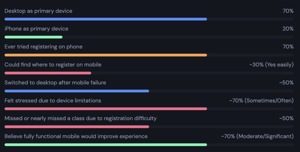
10 ODU students completed a Google Forms survey covering device use, early vs. current registration confidence, mobile friction, and trust in the system.
Market Research
| Competitor | Type | Strength | Weakness |
| MyMav | Direct | Mobile-responsive course search with filters; works fully on phone | Interface density can overwhelm new users |
| Coursicle | Indirect | Clean mobile-first schedule planner | Doesn’t actually register — requires going back to the university system |
| Rate My Professors | Similar | Mobile-optimized search, filters, and user reviews | No actual registration functionality |
SYNTHESIS: Clusters -> Patterns
Interview quotes and survey data were grouped into friction-based clusters. Each cluster represents a recurring pattern across multiple users
| Friction: Initial Registration Uncertainty 90% rated early confidence ≤3/5. Unclear degree paths, advisor miscommunication, and confusing UI create a high-anxiety starting point. | Behavior: Device-Based Registration Attempts 70% have tried registering on phone. Most are eventually forced to switch devices, a significant friction loop every semester. | Friction: Mobile Interface Discoverability Issues The class search option doesn’t exist on mobile. Students tap through unrelated tabs (Schedule Details, Tuition & Fees) before giving up. |
| Experience: Present System Confidence Level 60% rate current confidence 4–5/5. Confidence grows through repetition; users learn workarounds, not because the design improves. | Emotion: Stress Impact & Academic Consequences ~70% experienced stress due to device limitations. ~50% missed or nearly missed a class because of registration friction. | Opportunity: Improvement Potential — Perception ~70% believe mobile-functional registration would moderately or significantly improve their experience. Appetite for change is strong. |
Persona
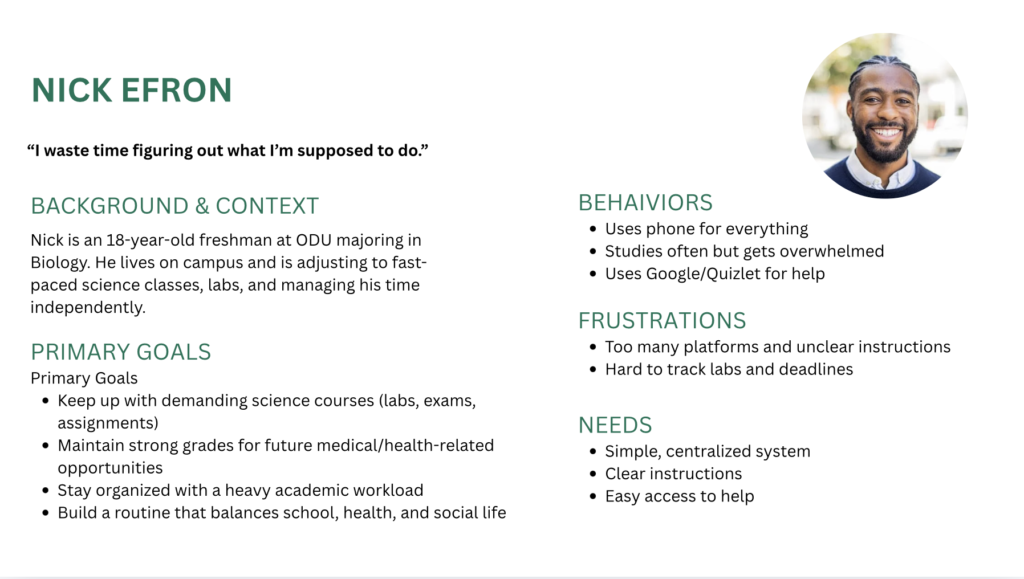
Who We’re Designing For
The Journey Mapped
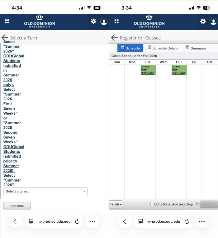
Open Leo Online on phone → Log in → Tap Registration Menu → Select Term → Look for “Search for Classes” → Only sees: Schedule / Schedule Details / Summary → Clicks each tab — none lead to class search → Gives up → finds desktop → registers late
Friction Points
- Class search feature hidden from mobile navigation
- Navigation tabs present irrelevant options, offering no path forward
- Time pressure creates acute stress during dead-end exploration
Redesigned Flow
Open Leo Online on phone → Log in → Dashboard with registration CTA → Select Term → Search for Classes → Filter by subject / time / instructor / Available to Register → Select section → Add to schedule → Confirm registration → Done
Key Decision Points
After selecting a term, the user must be able to search, this is where the current flow completely breaks. The redesign makes this the primary action. A secondary decision point is section selection, where conflicts and prerequisites must be surfaced clearly on small screens.
Design Process
From Sketch to Screen
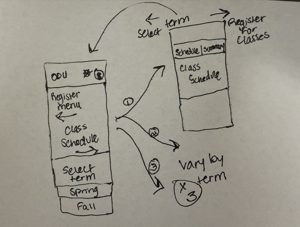
Initial wireframes focused on two critical screens: term selection (already functional on mobile) and a new class search screen (missing from the current system). Sketches explored how to adapt a search-results list to a narrow mobile viewport without requiring pinch-zoom or horizontal scrolling.
FRAME 1
Select Term screen: existing mobile layout, preserved as starting point
FRAME 2–4 (NEW)
Class Search tab added as primary action; search bar + filter row above results list
FRAME 6
Refined layout and tighter navigation, “Register for Classes” as priority
UI Design
The prototype follows ODU’s existing brand (navy/grey) to ensure brand guidelines. The redesign adds a persistent “Register for Classes” button in the top navigation bar, visible at all times — eliminating the need to hunt through menus.
Prototype Flow (Figma)
The interactive prototype covers the complete path: select term → search for class → select section.
Before:
Mobile users see a static week calendar with tabs for Schedule Details, Summary, and Tuition & Fees. No class search. No “Register for Classes” entry point. Students hit a dead end and must find a desktop.
After:
Top navigation bar shows persistent “Register for Classes →” link. After selecting a term, a search bar and filter row appear. Results display as scrollable cards with section times, instructor, seats remaining, and a one-tap “Add” button.
MOSCOW PRIORITIZATION
MUST HAVE
- Mobile class search with keyword + subject filter
- Persistent “Register for Classes” navigation CTA
- Section availability (seats remaining) on search results
- One-tap section add to schedule
- Registration confirmation screen
SHOULD HAVE
- Filter by time slot, days of week, instructor
- Prerequisite / restriction warnings surfaced inline
- Progress indicator during registration flow
- Saved search preferences across sessions
COULD HAVE
- Visual weekly calendar with drag-to-plan
- Push notifications when waitlisted seat opens
- Degree audit integration (which requirement does this satisfy?)
- Peer-popularity signal
WON’T HAVE (THIS ITERATION)
- Full advisor chat integration
- Grade history / transcript access
- Financial aid / billing management
- Cross-university course browsing
THE FINAL BUILD
The final prototype is a Figma prototype covering the complete mobile registration flow from select term to select section. All screens are interactive with tappable hotspots mirroring the real user journey.
Clear User Flow
Select Term → Search for Classes → Filter Results → Select Section → Confirm → Done
Reflection
What Worked
- ✓ Survey revealed 70% felt stressed due to device limitations — a systemic problem understood through research
- ✓ Clustering method successfully identified friction-behavior-emotion patterns from mixed qualitative + quantitative data
What Didn’t Work
- Sample size of 10 survey responses and 3 interviews limits statistical confidence
- All interview participants were seniors — underclassmen (most affected) were underrepresented
INSIGHT
The most important insight from this project wasn’t about UI as expected— it was about access. A feature gap that many senior desktop users rated as a “1 out of 5” problem is a critical blocker for device-limited students. Good UX research surfaces those invisible inequities, and good design removes them. I also learned that confidence built through workarounds isn’t the same as a usable system — users adapting to broken design is a sign of failure, not success.